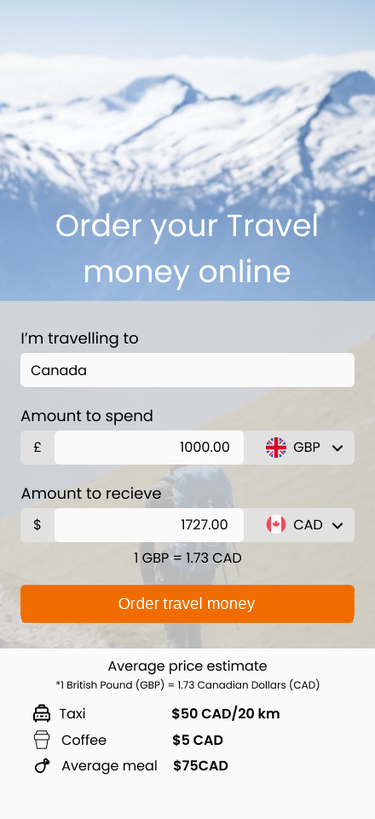
Travelex — Digital Transformation of a Cross-Border Currency Exchange Platform
Improving conversion, clarity, and scalability across a B2B2C FX checkout ecosystem
Improving conversion, clarity, and scalability across a B2B2C FX checkout ecosystem
Travelex operates in the foreign exchange and travel money space, where users complete high-friction financial decisions involving currency conversion, payments, and fulfilment.
This project focused on transforming a fragmented digital experience into a scalable, white-label platform supporting both B2C customers and B2B partners, including Sainsbury's.
When I joined, the programme had stalled due to unclear scope, siloed teams, and a lack of shared understanding of user and partner needs. My role was to reintroduce structure, align stakeholders, and define a scalable design approach that could support the end-to-end currency ordering and checkout experience (B2C), white-label partner experiences (B2B), and internal operational and compliance constraints.

The platform was struggling to support a coherent end-to-end experience across the currency ordering and checkout journey.
At its core, the issue wasn't just UX execution — it was a lack of alignment around the end-to-end transaction journey.
I stepped into a partially delivered programme operating across multiple teams and constraints — B2C, B2B, Salesforce platform limitations, compliance, and fulfilment workflows.
My focus was to:
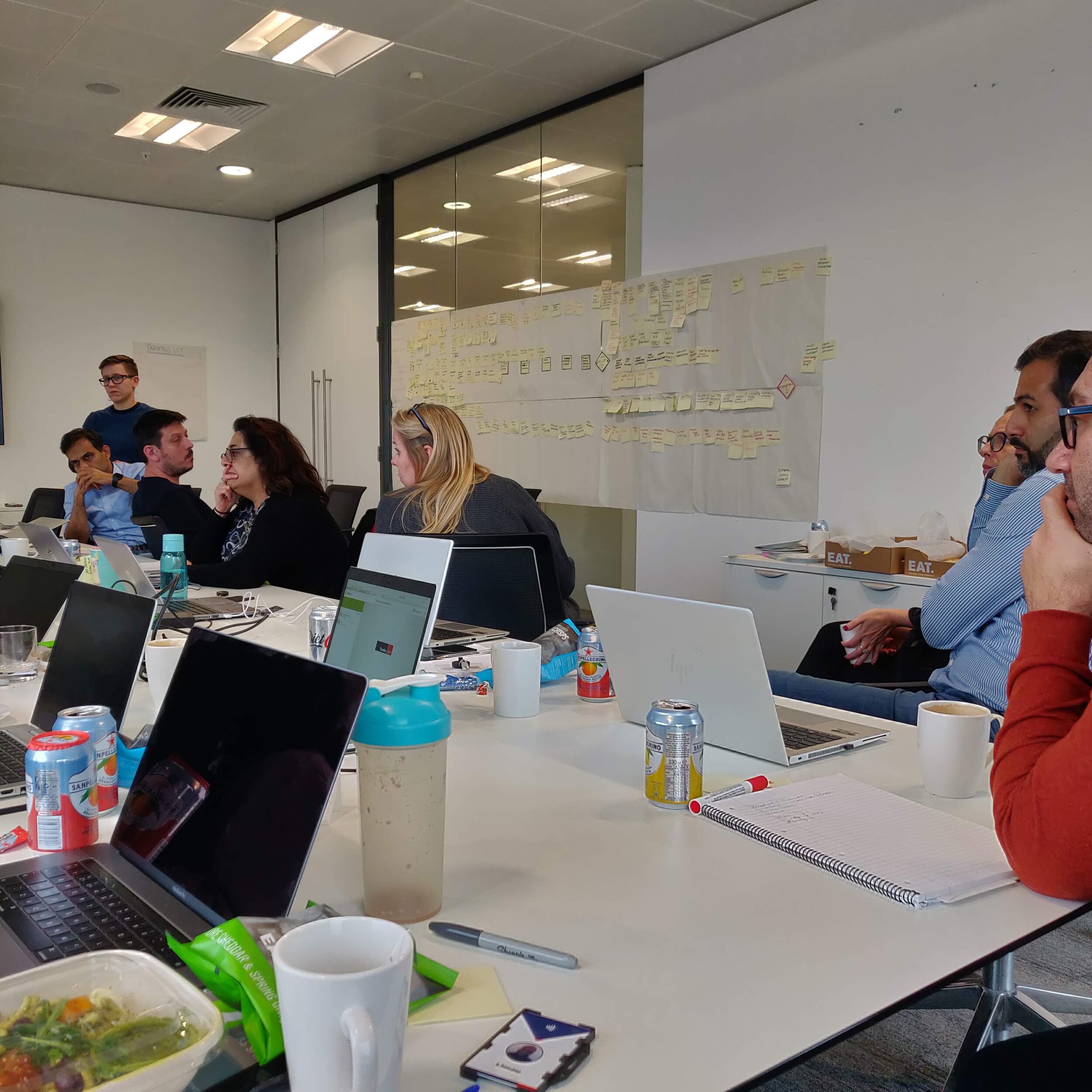
Through UX audits and stakeholder conversations, I identified that the experience had evolved as disconnected features rather than a coherent transaction journey.
I mapped:
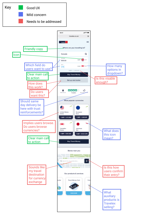
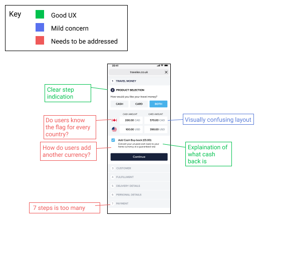
I introduced a modular approach that moved the team away from bespoke feature delivery towards a scalable transaction system.
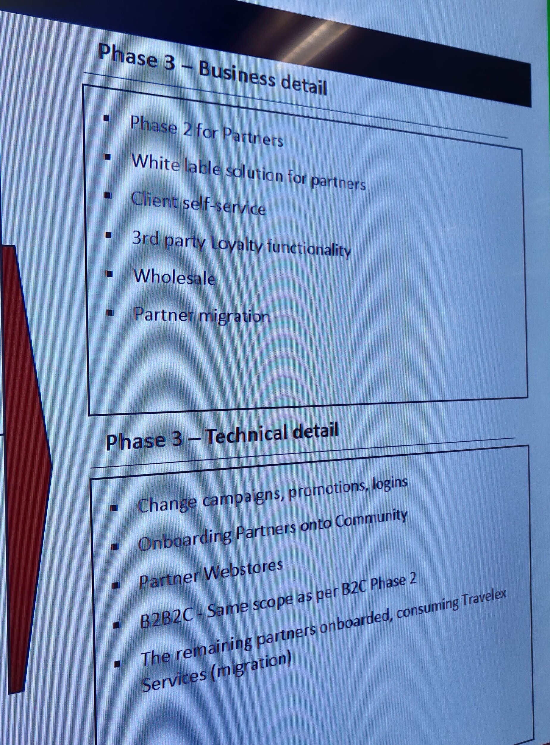
We aligned Phase 3 on Sainsbury's as the validation partner — Travelex's largest B2B client — to test the approach in a high-impact context.
I created a service design blueprint mapping the full currency ordering ecosystem — from currency selection through FX understanding, checkout, payment, and fulfilment — alongside B2B configuration layers and internal operational dependencies.
This blueprint became an easily accessible artefact which centralised all of the previously fragmented research projects that had been done for the project — used to align stakeholders, identify gaps, and guide prioritisation. I positioned it as a living document, encouraging continuous input as assumptions were validated or disproven.
.jpg)
Using the service design blueprint, I worked with the team to redefine project scope — shifting from bespoke partner builds to a modular white-label system that partners could configure with minimal engineering overhead.
I structured the work into Agile design sprints embedded within the wider Waterfall delivery model, reintroducing momentum without disrupting existing processes.
I used early wireframes not as final solutions, but as a tool to:
Through collaborative reviews with product, engineering, and stakeholders, I was able to identify gaps in understanding and extract key business assumptions, which were then fed back into the service design blueprint.
This iterative loop helped move the team from opinion-based decisions to evidence-informed design.
I conducted sessions with Sainsbury's stakeholders, using the service blueprint as a foundation to guide discussion.
These conversations helped:
One key insight was the importance of promotional flexibility, with Sainsbury's wanting the ability to highlight offers within the experience—this was incorporated into the evolving design strategy.
To manage competing priorities, I facilitated a prioritisation workshop using the MoSCoW framework.
This enabled stakeholders to:
This step was key in maintaining momentum and preventing further scope drift.

I structured the work into four focused design sprints:
I prioritised the entry module and checkout flow first, as they had the highest impact on conversion and user experience.
For the checkout flow, I:
This ensured designs were not only user-centred but also buildable within platform constraints.

I redesigned the checkout experience to reduce friction across the currency ordering journey:
A key insight from the service blueprint was that users lacked confidence in how much currency to purchase for their trips. I introduced contextual guidance — suggesting typical spend by destination — to reduce decision friction at the earliest stage.
COVID-19 and the absence of a dedicated research budget made traditional user testing impossible. I adopted a pragmatic approach to reduce risk:
Working with the Data Specialist and UX Researcher, I documented a structured A/B testing framework to sustain learning after launch — covering key hypotheses, testable design variations, and success metrics.
This ensured the project didn't stop learning once it shipped, despite the earlier research constraints.
I worked closely with Salesforce engineers and compliance teams throughout delivery — attending weekly production meetings, providing detailed design assets and functionality notes via Confluence, and ensuring alignment between design intent and implementation.
Regular check-ins with Sainsbury's stakeholders kept the build transparent and grounded in partner feedback.
The project progressed with renewed clarity, with Sainsbury's actively engaged in the design process and the team equipped to continue iterating through A/B testing post-launch.
This project reinforced something I've seen across complex programmes: the blocker is rarely execution — it's the absence of a shared model of the problem.
Design artefacts like the service blueprint weren't just deliverables. They were the mechanism by which fragmented teams found common ground and regained momentum.
If I were to revisit this, I would push earlier for lightweight external validation — even within constraints — to stress-test assumptions before they compound into delivery risk.