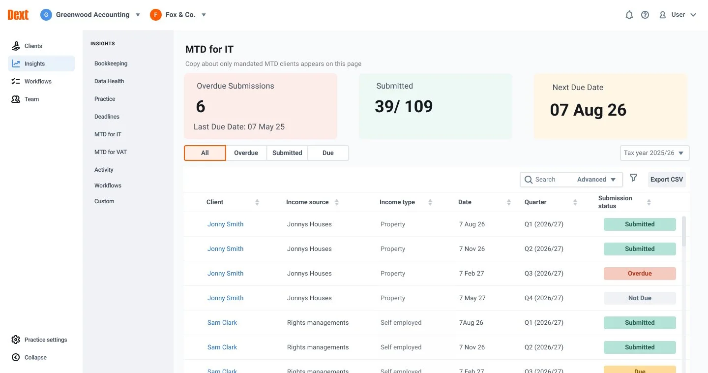
Dext MTD IT Dashboard —
Product Design Leadership
High Volume Making Tax Digital Compliance Platform
High Volume Making Tax Digital Compliance Platform
The introduction of Making Tax Digital for Income Tax (MTD IT) represents the largest shift in UK personal tax compliance in a generation. Accountants are now required to submit tax data quarterly, increasing submission volume by 4× per client.
Dext Solo exists to help accounting practices manage this new workload efficiently, accurately, and at scale. As Senior Product Designer, I led the design strategy for a new practice-level MTD dashboard. This required designing for workflows that users understood intellectually but had not yet operationalised—making early judgment and prioritisation critical to long-term adoption.

"Make Dext Solo the default specialist solution for managing MTD IT quarterly workload at scale — by reducing the marginal cost of compliance for accountants without disrupting their existing year-end tax workflows."
This framing helped the team prioritise design decisions that reduced ongoing operational cost, rather than optimising only for first-time use.
As the sole Product Designer in the squad, I was responsible for defining and maintaining a clear design process, advocating for user needs, and helping the team make informed trade-offs when constraints emerged. I focused early on understanding where design effort would have the greatest impact on risk reduction, efficiency, and long-term adoption.
I created a project plan that made delivery risk explicit early, allowing the team to agree on where we could afford iteration and where we needed early certainty. I then reviewed it with the Product Manager to ensure feasibility within the regulatory timeline.
Together, we explored where the MTD dashboard should live within Dext Solo's information architecture and identified which adjacent areas of the product would be affected. This helped ensure the dashboard worked as part of a broader workflow rather than a standalone surface.
Once I had clarity on the brief and constraints, I facilitated a cross-functional workshop to align stakeholders on the problem space, surface assumptions, and agree on scope.
The workshop focused on:
The outcome was a shared scope document, circulated to all stakeholders, which became the reference point for delivery decisions and trade-offs throughout the project.

To ground our approach, I used AI tooling to quickly map the competitive landscape, allowing the team to spend more time evaluating patterns and trade-offs rather than assembling the list itself. I then analysed competitors' design patterns, prioritisation of information, and user journeys — particularly how they handled high-volume, time-sensitive workflows.
This helped establish a baseline for what users were likely to expect and highlighted opportunities to differentiate through clarity and risk visibility rather than feature depth.

Using insights from the scoping workshop and competitor analysis, I worked with the Product Manager and Dext Solo domain experts to define the critical journeys the MTD dashboard needed to support.
We aligned on two core needs:
These journeys became the foundation for all subsequent design decisions.

I created initial wireframes exploring a practice-level dashboard that balanced overview and actionability. Key concepts included summary data tiles, segmented controls, nested table structures, and submission status badges designed to reduce scanning effort and surface risk quickly. At this stage, my focus was not visual fidelity, but validating which information hierarchy would most reduce error under time pressure.

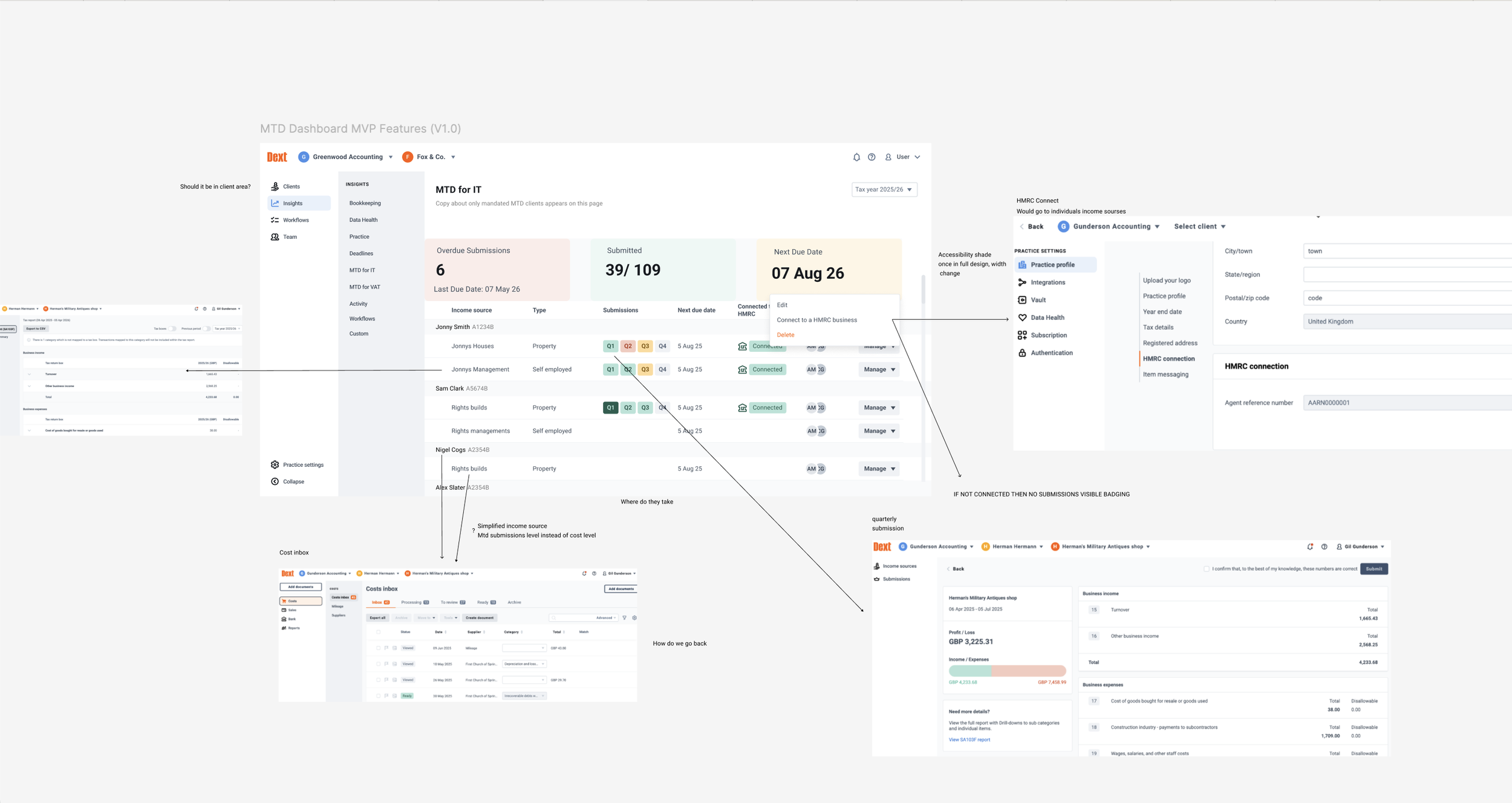
I reviewed these wireframes with engineers early to assess feasibility within the existing codebase. Several interaction patterns — such as nested rows combined with segmented filtering and multi-quarter badges — were not viable within the timeline or technical constraints.
Based on this feedback, I iterated the designs to align with what could be safely delivered, while identifying which elements I believed were essential to validate with users rather than discard outright.

One major point of tension was the inclusion of summary data tiles. Engineering were hesitant to build them due to the lack of existing components and long-term maintenance concerns.
I believed rapid visibility of compliance risk was foundational to trust in the product, so I validated this assumption with users rather than treating it as a subjective preference. I ran remote guerrilla testing with six accountants who would be submitting up to five times per year once MTD IT was implemented.
Participants were shown versions of the dashboard with and without data tiles.
Another unexpected finding was that some call-to-actions were missed entirely, even by experienced Dext Solo users. The assumption had been that onboarding familiarity would compensate for unclear affordances. Testing showed that under cognitive load, users did not adapt — they missed actions. This reinforced the need for explicit, scannable cues in a high-pressure compliance context.
While participants also highlighted frustration with repeated client names increasing cognitive load, resolving this fully would have required patterns that were not feasible for the initial release.

Based on user evidence, I advocated for a phased release rather than permanently descoping the data tiles or delaying launch.
We aligned on:
This allowed us to meet regulatory deadlines while protecting the long-term quality bar of the product.
Ahead of release, I worked with the Product Manager to ensure the right data points were captured to evaluate effectiveness. In addition to adoption metrics tied to NRR, we tracked indicators of cognitive load, such as users clicking into incorrect quarters — an early signal of error-prone design.
This instrumentation allowed us to assess whether design compromises introduced risk and to build evidence for future iterations.
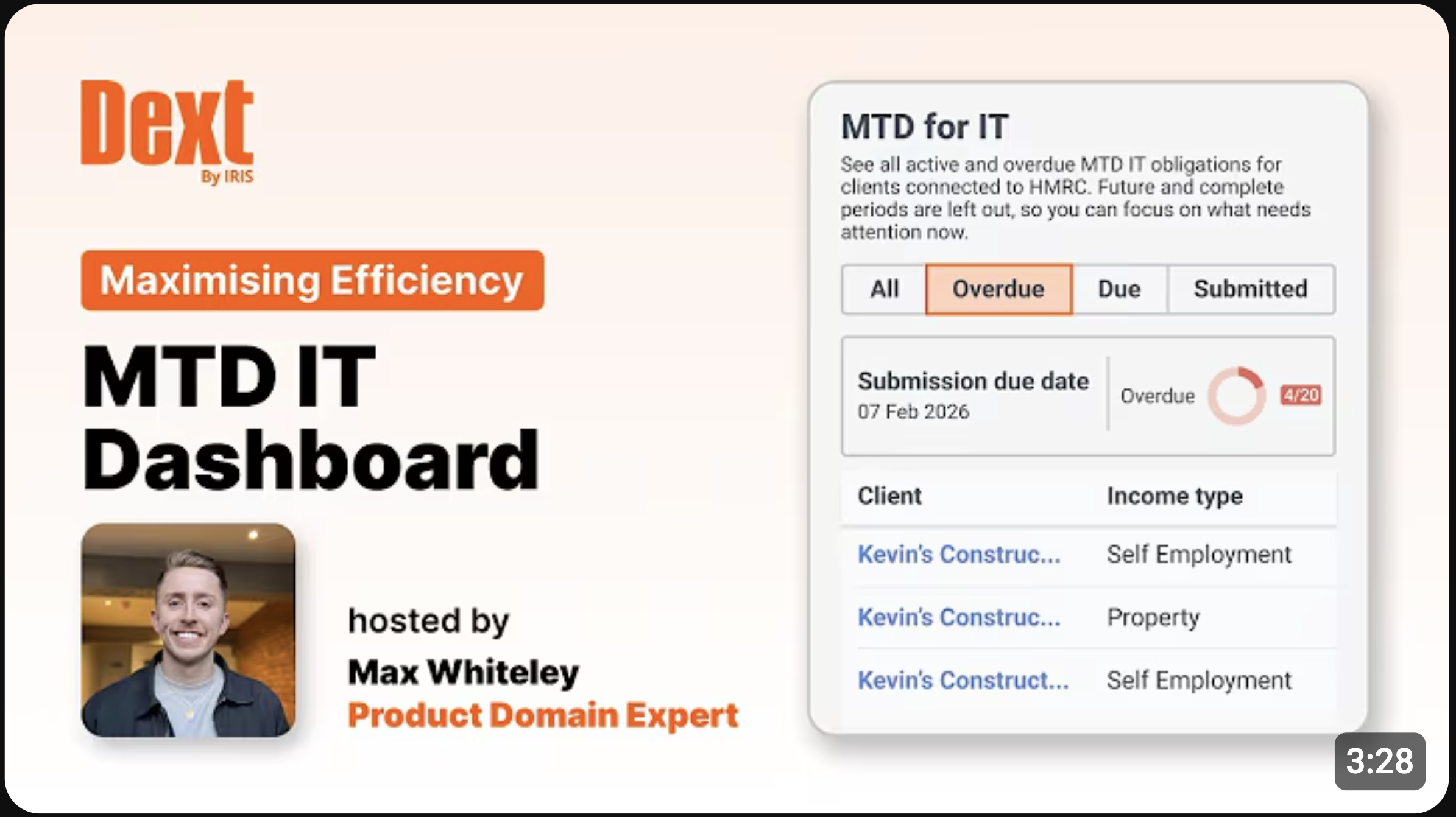
Sales teams used the dashboard extensively in online demos and at Accountex in conversations with prospective accounting partners, reinforcing its role in cross-sell and retention discussions.
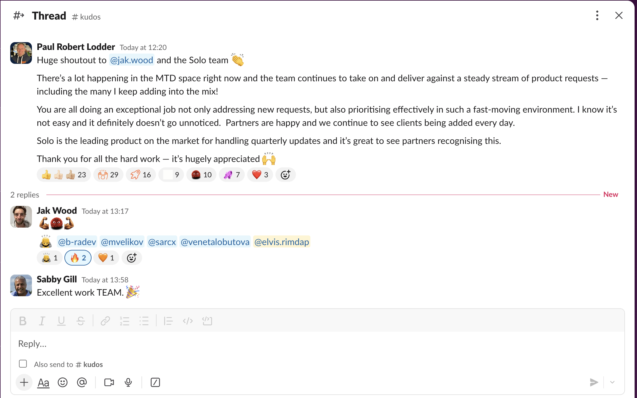
The strong early adoption validated our decision to prioritise practice-level visibility and summary risk indicators, even before the legislation was fully enforced.
This project reinforced my approach to senior design work: prioritise error reduction over elegance, validate convictions with evidence, and sequence delivery in a way that preserves long-term product integrity.
If I were to revisit the project, I would invest earlier in clarifying affordances for high-stress workflows, even when users are familiar with the product. Designing for regulation is less about elegance and more about reducing the probability of human error at scale.